PrF UG forms all
Contents
- 1 Forms
- 1.1 Understanding Forms
- 1.2 The Forms Tab
- 1.3 The Form Browser
- 1.4 The Form Buttons
- 1.5 The Form Editor
- 1.6 The Display Slot Menu
- 1.7 The Selected Widget Type Menu
- 1.8 The Widget Configuration Dialog
- 1.9 The Form Configuration Dialog Box
- 1.10 Default Widget Types
- 1.11 Additional String Widgets
- 1.12 InstanceRowWidget and InstanceTableWidget
- 1.13 ContainsWidget
- 1.14 DirectInstancesWidget
- 1.15 Changing Global Characteristics
- 1.16 Moving or Resizing a Widget
- 1.17 Changing Widget Configuration Properties
- 1.18 Selecting a Widget Display
- 1.19 Hiding a Widget
- 1.20 Customizing an InstanceRowWidget or InstanceTableWidget
- 1.21 Customizing a ContainsWidget
- 1.22 Using a ResourceListWidget
- 1.23 Additional Widget Types
Forms
This section of the User's Guide covers the concepts of understanding, creating, and using Protege-Frames forms.
Note: Before you create and use classes, you should be confident with the basic Protege-Frames interface. You should also be comfortable with Protege-Frames projects, project types, windows, classes, and slots.
To return to the main table of contents, click the Protege-Frames User's Guide link (located at the top of the table of contents on the right-hand side of this page).
Understanding Forms
Once you have built the classes and slots of your ontology, you will want to begin to create instances. This is done by filling out forms. The Forms tab allows you to customize the user interface that will be used for entering instances. In Protege-Frames, the expectation is that ontology creation and instance entry could be done by different groups of people:
The Classes and Slots tabs are used by domain experts and knowledge engineers to create ontologies - that is, to design a set of classes that describe the domain. For example, a team of medical specialists could design an ontology dealing with blood diseases.
The Instances tab is used to acquire instances. It is typically used by people who are neither domain experts nor knowledge engineers. For example, nurses at a hospital could use the ontology above to enter instances to describe each patient.
The Forms tab generates the basic user interface for instance entry:
A class has template slots, each of which has a value type.
The form for a class is composed of widgets, each one of which corresponds to a template slot. The appearance of the widget is based on the slot value type.
When a user enters an instance, each widget becomes an entry field in the Instance Editor.
Every class, concrete or abstract, has an associated form. For a concrete class, a user defines an instance of the class by filling out the class's form. For an abstract class, the form is used to define layout information which can then be inherited by other classes.
Using the Forms tab, you can customize the appearance of forms. Protege-Frames generates a default form for every class you create, based on the slots that are attached to the class and their slot value types. On the default form, there is a widget for every slot that is attached to the class.
The default form is intended as an initial, useful set of forms; however, these default interfaces are not always user-friendly. For example, if a class has a slot such as name or title, you might want the form to display this field first. The default form probably will not do this for you.
Different slot value types use different widgets: for example, a string slot uses a text entry bar widget, while a Boolean slot uses a checkbox. You can customize the form by moving and resizing widgets and deleting widgets; for some slot value types, you can also select another widget that is different from the default. For example, you can set up a widget which displays Symbol values as icons and allows the user to select those.
The Forms tab also allows you to create several user interfaces for the same ontology - forms for knowledge acquisition can be customized for different groups of users.
The Forms Tab
The Forms tab provides a single window in which you may view and edit prototype forms. The forms you design and create at the Forms tab can be viewed in their final format at the Instances tab. End users will use the finished forms to enter instances into the knowledge base.
The Forms tab consists of two panes:
The Form Browser pane, at the left, shows the hierarchy of all the classes and allows you to clear all customizations from your form. You can also create a form with one of the following preset layouts: the default, a form that has been created for a superclass, or a form for another class.
The Form Editor pane, at the right, shows the layout of the form associated with the selected class. Each slot in the class is associated with a user-interface widget on the form. If you have not modified the form, Protege-Frames uses a default layout based on the slot type and cardinality.
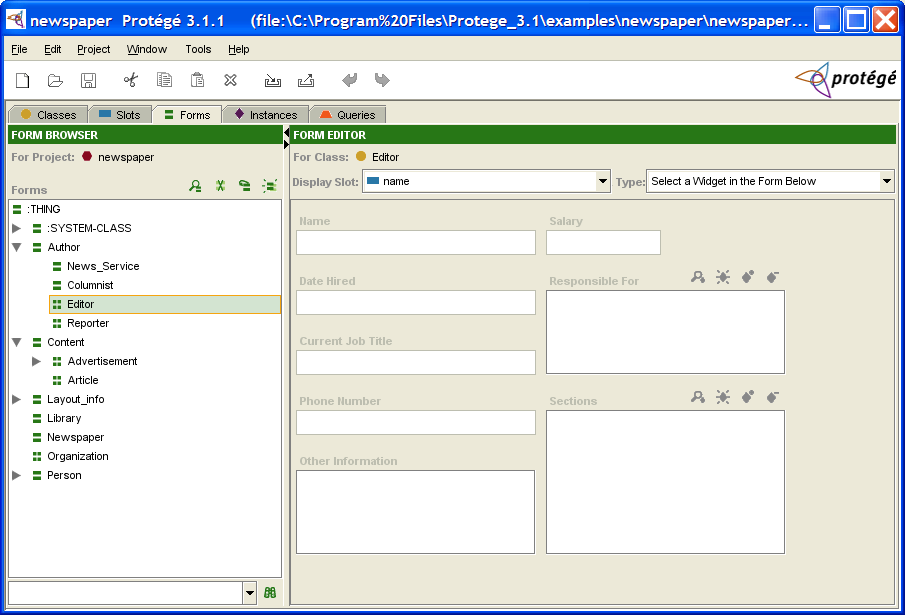
As mentioned above, the forms you design will appear at the Instances tab. Click to see this example as it appears at the Instances tab.
The Form Browser
The Form Browser, at the left of the Forms tab, displays all the classes in your project. To ensure that the selected class is the same one that was selected at the Classes tab or the Instances tab, you can synchronize class trees.
The Form Browser has three components:
The Forms window displays the hierarchy of the classes in your project. Icons give more information about the form associated with the class. You cannot change the hierarchy in this window. To edit the hierarchy, use the Classes tab.
The Form buttons, at the top right of the pane, allow you to clear all customizations from your form as well as to create a form with a preset layout.
The Forms lookup bar, at the bottom of the pane, allows you to locate a form in the Forms window by typing all or part of the name and clicking the binoculars.
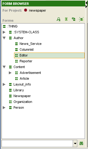
The Forms Window
This displays all the forms in the project, ordered by the names of their associated classes. When a single form is selected in this window, its associated form is displayed in the Form Editor to the right. If you have not created or modified the form, Protege-Frames uses a default layout, based on the slot type and cardinality.
The following icons, shown at the left of each form name, provide information about the form associated with the class:
|
The form uses the default layout that is automatically created by Protege-Frames. | |
|
The form has been customized.
You can customize a form by altering its widgets, for example:
moving or resizing a widget, changing a widget's label,
or selecting which buttons appear for the widget.
See Modifying a Widget's Appearance
for more information.
You can clear all customizations for the selected form by clicking the Remove Customizations
( |
Hierarchy Icons
The following icons, shown at the beginning of each line, provide information about the display of the class hierarchy:
The Form Buttons
The Form buttons, at the top right of the Form Browser, allow you to change the layout of the selected form.
|
View Form Customizations: Opens the Form Configuration dialog box for the selected form. | |
|
Remove Form Customizations: Clears all customizations for the selected form. This will return the form to the default layout, which has the following characteristics:
| |
|
Relayout Form with Current Widgets: Creates a default layout using the current widgets. This means:
| |
|
Layout Form Like: Displays a dialog box of all forms and allows you to choose one as a basis for your layout, as follows:
|
You can also customize a form in a number of ways, by customizing global properties as well as changing individual widgets on the form. See the Forms Table of Contents for more information.
The Form Editor
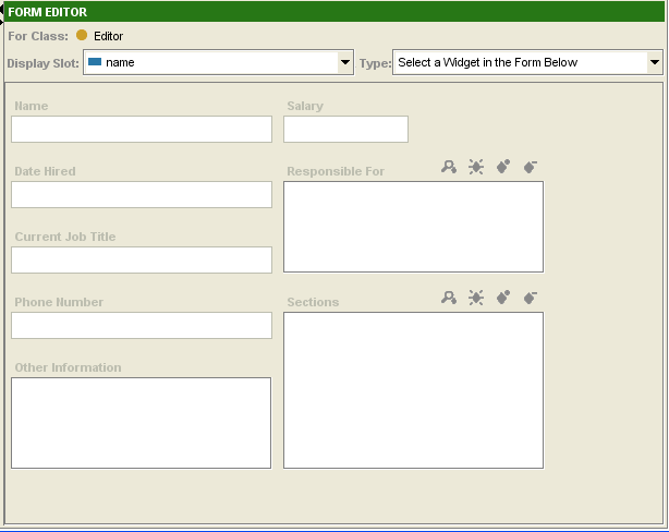
The Form Editor shows the layout of the form associated to the selected class and allows you to edit the form's layout.
Components
The Form Editor has the following components:
The Display Slot menu, which allows you to choose the display slot for the form.
The Widget Type menu, which allows you to choose a widget type for the currently selected widget, if any.
A number of user-interface widgets. The currently selected widget, if any, is outlined in blue. Widgets are translated to entry fields in the Instances tab, and control how users will enter information as instances. Each slot in the class is associated with a user-interface widget on the form.
In addition, double-clicking on the Form Editor brings up a dialog box, as follows:
Double-clicking on any widget brings up the Widget Configuration dialog for that widget, which allows you to view widget information and edit the widget's configuration, depending on the widget type.
Double-clicking on the background of the Form Editor brings up the Form Configuration dialog, which allows you to view the widget type for each widget, redisplay hidden widgets, and select which widget, if any, takes up most of the horizontal and/or vertical space as the form expands.
Default Layout
If you have not created or modified the form, Protege-Frames uses a default layout, as follows:
Widgets appear in an order that is based on their size and type.
Each widget has a standard type, based on the slot's value type and cardinality.
Each widget has a standard size, based on the widget type.
The layout that you create in the Form Editor appears in the Instance Editor. Users fill in the form, entering instances into the knowledge base. You can use the Form Editor to design an interface which allows easy entry of the disparate types of information represented by the different types of slots.
Editing Tools
There are a number of basic editing tools provided on the Form Editor. Some of the actions you can perform with widgets are:
Moving widgets to a different location and/or resizing them.
Hiding or redisplaying a widget.
Selecting a different type of widget from the Select Widget Type menu.
For widgets with buttons, choosing which buttons are displayed.
Note: It is also possible to create customized widgets, using the programmer's interface.
Global Edits
You can also make changes to the global properties of the form, including:
Selecting a display slot, which is used to identify the different instances when they are displayed in a list.
Selecting a single widget that will expand to take up most of the form, rather than having all widgets resize proportionally.
The Display Slot Menu
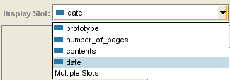
The Display Slot menu allows you to choose the display slot, used to identify the different instances when they are displayed in the Instance Browser or on a list.
The display slot can also be set at the Instances tab. See Setting the Display Slot for more information.
If you do not select a slot to use as a display slot, Protege-Frames uses a default key, <instance name>, such as newspaper_0017. It is usually helpful to set a display slot.
If you set a display slot for a class, the slot is inherited by any subclasses.
The Selected Widget Type Menu
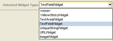
The Selected Widget Type menu allows you to choose the widget type, that is, the way the information for that slot is formatted for the currently selected widget. The choices for widget type depend on the value type of the slot. Each value type has a default widget for the slot, as well as a preset list of possible widget types, based on the slot's value type.
Clicking on the menu displays a list of possible options for the currently selected widget. Making a new selection will change the appearance of the widget on the form.
For example, for a String field of Single Cardinality, you can select a number of widgets, including a TextAreaWidget, TextAreaWidget, a UniqueStringWidget, or a YellowStickyWidget.
If you select <none> from the Widget Type menu, the widget is removed from the Form Editor and is not displayed in the Instance Editor for that class. To redisplay a widget that has been removed, open the Form Configuration dialog (by double-clicking on the background of the Form Editor) and choose a different display type for the widget.
The Widget Configuration Dialog
The Widget Configuration dialog box allows you to customize the label, buttons, and other properties of a selected widget. This dialog has a number of tabs, depending on the widget type.
Note: To select a different widget type, use the Form Configuration dialog or the Selected Widget Type menu.
The General Tab
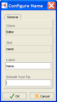
The General tab displays the names of the class and slot with which the widget is associated. For simple widgets, the General tab is the only tab that is available.
You can customize the following at the General tab:
Edit the Label that is used for the widget on the form.
Create a Tool Tip that displays when the user hovers the cursor over the widget label.
The example below shows the General tab for the Name widget in the Editor form.
The Buttons Tab
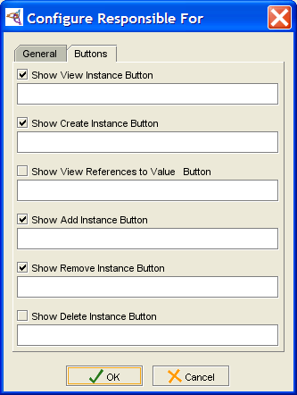
The Buttons tab is available for widgets with buttons, such as Class and Instance widgets, as well as all widgets with multiple Cardinality. For example, the dialog box for a standard InstanceListWidget also has a Buttons tab. This tab allows you to choose which buttons to display on the form.
Additional Tabs
The InstanceRowWidget, InstanceTableWidget, and ContainsWidget show additional widget-specific tabs. See the topics for these widgets for more information.
The Form Configuration Dialog Box
The Form Configuration dialog box allows you to:
View the list of available widgets for the currently selected form.
Change the widget type for any widget, including redisplaying currently hidden widgets.
Select a single widget that takes up extra horizontal and/or vertical space as the form expands.
The Widgets Tab
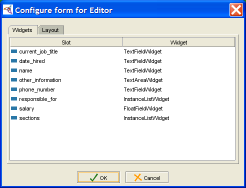
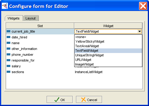
The Widgets tab displays all of the widget information for the form. For example, the Widgets tab in the Form Configuration dialog box for Editor lists all the slots for Editor with the currently selected widget type.
If a widget has been hidden by choosing <none> from the Widget Type menu, you can redisplay the widget by selecting a different widget type (under the Widgets tab in the Form Configuration dialog box).
The Layout Tab
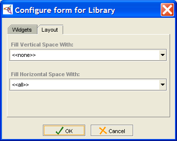
The Layout tab displays the current layout information. You can use the Layout tab to choose a widget that will expand when the form expands as the Protege-Frames window is resized. This can be useful, for example, when you have a complex table widget that you wish to have take up most of the form. You can choose a widget that expands vertically and a widget that expands horizontally. If you wish, these can be the same widget.
Selecting <<none>> from the menu means that the widgets do not expand even if the form does. Selecting <<all>> from the menu means that each widget is resized an equal amount. The default is to have all widgets expand horizontally and none expand vertically.
Default Widget Types
The Form Editor displays a widget for each slot in the class. In the Instance Editor, these widgets are displayed as fields where users can enter the information for that slot. The possible display and options for the widget depend on the type of information that is included in the slot. For more information on the different types of slots and fields, see the Instances Table of Contents.
When Protege-Frames generates a default layout, it creates a default widget for each slot. These widgets are described below. Protege-Frames provides widgets for both Single and Multiple cardinality. For simplicity, only the Single cardinality is shown. For a description of the Multiple cardinality widget, see the topic for the corresponding field.
Note: These topics describe the default widgets only. You can select different formats for the widgets using the Widget Type menu.
| Value Type | Field Type | Default Widget |
|---|---|---|
|
CheckBoxWidget: a checkbox widget that is true when selected or false when blank | ||
|
ClsFieldWidget: a display widget and buttons that allow the user to specify a class as the field value | ||
|
FloatFieldWidget: an entry widget that verifies that the entered value is a valid decimal number | ||
|
InstanceFieldWidget: a display widget and buttons that allow the user to specify an instance as the field value | ||
|
IntegerFieldWidget: an entry widget that verifies that the entered value is a valid whole number | ||
|
TextFieldWidget: an entry widget that verifies that the entered value is a valid string | ||
|
ComboBoxWidget: a drop-down list that displays the Symbol's preset list of values |
In addition to these widgets, Protege-Frames also provides a graph widget, which allows you to display relational information in the form of a diagram or graph.
Additional String Widgets
There are a number of additional widget types available for String widgets.
Single Cardinality String Widgets
The following widgets are available for a String field of Single cardinality. These widgets can be chosen by selecting a String widget at the Forms tab and then selecting the desired widget from the Widget Type menu:
YellowStickyWidget
Displays the string entry field as a yellow sticky note.
TextAreaWidget
Displays the entry field as a text area - useful for extensive strings.
UniqueStringWidget
Identical in appearance to the default TextStringWidget, but verifies that the entered string is a unique value, i.e., it is not the same value at any other instance.
URLWidget
Allows the user to enter and display a URL.
Entering a URL and pressing Enter/Return
or clicking Home (![]() )
loads the URL into the field.
Clicking View in Browser
(
)
loads the URL into the field.
Clicking View in Browser
(![]() )
opens the URL in the default browser.
)
opens the URL in the default browser.
ImageWidget
Allows the user to enter the path to an image. Pressing Enter/Return loads the image.
Multiple Cardinality String Widgets
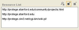
The following widget is available for a String field of Multiple cardinality.
ResourceListWidget
Allows the user to enter a list of URLs; checks to see that the syntax of the entered string is a valid URL, but does not verify that the URL is available. See Using a ResourceListWidget for more information.
InstanceRowWidget and InstanceTableWidget
InstanceRowWidget is an optional widget for slots of type Instance with single cardinality (at most equal to 1). It shows all slot values for the instance. (The default widget, InstanceFieldWidget, only shows the name of the instance that is selected as the value of the slot.)
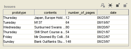
InstanceTableWidget is very similar to InstanceRowWidget, except that it is available for Instance slots with multiple cardinality (at most not specified or greater than 1). So, it can display multiple rows of information.
For information on how to customize the display of this widget, see Customizing an InstanceRow- or InstanceTableWidget.
ContainsWidget
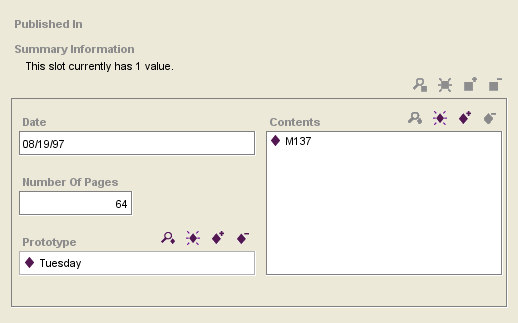
ContainsWidget is an optional widget for slots of type Instance. The default widget, InstanceFieldWidget or InstanceListWidget, lists Instance(s) that are selected as the value of the slot. ContainsWidget actually contains a version of the form for each instance that is a value of the slot.
ContainsWidget is useful primarily for Class or Instance slots where the Class Editor for the Allowed Classes is fairly simple, and where the cardinality is single or small. For a widget that provides a summary of selected fields, see InstanceRowWidget or InstanceTableWidget.
For information on how to customize the display of a ContainsWidget, see Customizing a ContainsWidget.
DirectInstancesWidget
DirectInstancesWidget is an optional widget for slots of type Instance. Similar in appearance and operation to the default InstanceFieldWidget or InstanceListWidget, this widget only permits direct instances of the Allowed Classes as slot values.
Changing Global Characteristics
You can change global properties of a form, including the display slot and the layout.
Setting the Display Slot
The display slot identifies the different instances when they are displayed in a list. For example, the form for Prototype_Newspaper has the display slot set to weekday. This means that, in the Instance Browser, the different instances are listed by the value in the weekday field.
If you do not select a slot to use as a display slot, Protege-Frames uses a default key, <instance name>, such as newspaper_0017. It is usually helpful to set a display slot.
To set a display slot for a class:
In the Form Browser, at the left of the Forms tab, select the name of the class whose form you wish to edit.
Click the Display Slot menu. A list of slots will be displayed.
Select the slot you wish to use as a display slot.
You can also set multiple display slots and/or set the display slot at the Instances tab. See Setting the Display Slot for more information.
Selecting a Widget that Expands with the Form
You can choose a widget that will expand as the form expands whenever the Protege-Frames window is resized. This can be useful, for example, when you have a complex table widget that you wish to have take up most of the form. To do this:
Double-click anywhere on the background of the form, that is, on an area that does not contain a widget. The Form Configuration dialog box will be displayed.
Click on the Layout tab.
To select a widget that will take up most of the vertical room when the form expands, select the widget name from the Fill Vertical Space With: menu. Selecting <<all>> means each widget will expand equally.
To select a widget that will take up most of the horizontal room when the form expands, select the widget name from the Fill Horizontal Space With: menu. You can select the same widget or a different one. Selecting <<all>> means each widget will expand equally.
To reset the form so that no widget expands more than the others, make sure that <<all>> is selected in both menus.
Note: For additional tasks that change a form's appearance, such as resizing, moving, changing, or hiding a widget, see the Forms Table of Contents.
Moving or Resizing a Widget
Moving a Widget to a New Location
To move a widget on the form:
Click on the widget to select it. A blue boundary will appear around the border of the widget.
Click in the interior of the widget and hold down the mouse button.
Drag the widget to the desired location.
Resizing a Widget
You can easily make a widget smaller or larger by resizing it. To do this:
Click on the widget to select it. A border will appear around the selected widget.
Click and drag anywhere on the border to resize the widget. Many widgets can only be resized horizontally (narrower or wider). You can resize Multiple Cardinality widgets both horizontally and vertically.
Note: You can select a single widget that will take up most of the form when the Instance Editor is resized on the screen by end users. See Changing a Form's Layout for more information.
Note: To hide a widget so that it won't be displayed on the form, use the Widget Type menu. See Selecting a Widget Display for more information.
Changing Widget Configuration Properties
The Widget Configuration dialog box allows you to customize the label, buttons, and other properties of a selected widget. This dialog has a number of tabs, depending on the widget type. For some widgets, you can customize additional properties. See the specific topic for the widget for more information.
Changing General Properties
You can change the following properties at the General tab of the Configuration dialog box:
the widget label: Each widget has a label - a string of text displayed in the left-hand corner of the widget. The default layout uses a version of the slot name for the widget label, where underscores are replaced by blanks and the first letters of the resulting words are capitalized. When end users actually enter instances, they use the label to determine the type of information they should enter.
the widget tool tip: This is displayed as a pop-up when the user holds the cursor over the widget label.
To change the General properties of a widget:
Double-click directly on the widget. The Widget Configuration dialog box will be displayed. (Note: If the Form Configuration dialog box is displayed, you have accidentally double-clicked somewhere on the background of the form. Close the dialog box and double-click on the widget.)
Enter the label you want in the Label field of the Widget Configuration dialog box. You can use a multi-word phrase.
To create a tool tip, type the text you want in the Default Tool Tip field.
To implement your changes, click OK.
Choosing a Widget's Buttons
Some widgets (e.g., Class and Instance widgets, Multiple Cardinality widgets) have buttons displayed on their upper right corners. You can turn the display of these buttons on and off individually. To choose which buttons are displayed for a widget:
Double-click directly on the widget. The Widget Configuration dialog box will be displayed. (Note: If the Form Configuration dialog box is displayed, you have accidentally double-clicked somewhere on the background of the form. Close the dialog box and double-click on the widget.)
If the widget has buttons, there will be a Buttons tab in the Widget Configuration dialog box. Click this tab.
Select the buttons you want to display by making sure there is a check in the appropriate boxes.
Click OK.
Selecting a Widget Display
Some slot types have multiple widget configurations that can be selected from the Widget Type menu. For example, a String slot can have a number of different widgets, such as a TextFieldWidget, TextAreaWidget, a UniqueStringWidget, or a YellowStickyWidget. By experimenting with these widgets, you can learn how to use them to get the desired display.
You can also remove a widget from the form by hiding it completely.
Using the Selected Widget Type Menu
To select a different display for your widget from one of the available configurations:
In the Form Browser at the left of the Forms tab, select the name of the class whose form you wish to edit.
Click the widget you wish to edit in the Form Editor. The widget will be outlined.
Click the Selected Widget Type menu. A list of possible widget types will be displayed.
Select the type of widget that you wish to use.
If you do not select a widget type, Protege-Frames uses a default type, based on the value type of the slot.
Using the Configure Form Dialog Box
You can also select different widgets, using the Configure Form dialog box.
To change the widget type for the slot:
Double-click on an empty part of the form to display the Form Configuration dialog box.
Click on the widget name in the widget column. A menu will show the list of standard widget types for the slot.
Note: If the menu does not display, click on the down arrow at the right.
Select the widget you want.
Click OK.
Hiding a Widget
In addition to selecting a different widget type, you can hide a widget completely, or redisplay a hidden widget.
Using the Selected Widget Type Menu
The Selected Widget Type menu, at the top right of the Form Editor, allows you to hide a widget:
Select the widget you wish to hide by clicking it once. The widget will be outlined.
Select <none> from the Selected Widget Type menu. The selected widget will be removed from the form.
Using the Configure Form Dialog Box
Double-click on an empty part of the form to display the Form Configuration dialog box.
Click on the widget name in the widget column. A menu will show the list of standard widget types for the slot.
Note: If the menu does not display, click on the down arrow at the right.
Select <none>.
Click OK.
Redisplaying a Hidden Widget
To redisplay a widget which is no longer visible on the form:
Double-click on an empty part of the form to display the Form Configuration dialog box.
Select the widget you want to redisplay by clicking on its name at the Widget tab.
Click on the text <none> under the Widget column.
Select a different display type for the widget.
Click OK.
Customizing an InstanceRowWidget or InstanceTableWidget
InstanceRowWidget (Single Cardinality) and InstanceTableWidget (Multiple Cardinality) show all the slot values for any instance that is a value of the slot.
You can perform the standard customizations:
Change the widget type of an Instance field to an InstanceRowWidget or InstanceTableWidget using the Widget Type menu.
Resize or move the widget using click and drag.
Change General properties and/or select Action Buttons, using the Configure Widget dialog box; see Changing Widget Configuration Properties for more information.
The Configure Widget dialog box for an InstanceRowWidget or InstanceTableWidget has the following additional customizations: Defining Columns, New Instances, In-place editing characteristics, Warnings and Suggestions.
Defining Columns
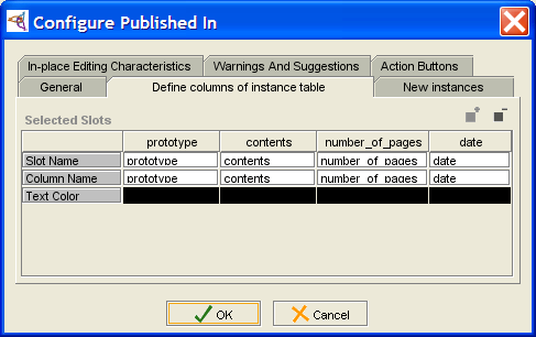
You can choose which slots to show in the widget and/or change the order in which they appear using the Define columns of instance table tab. Although the current implementation does not allow you to change the order directly by dragging, you can reorder the slots by first removing them from the widget, and then adding them back in the order in which you wish them to appear.
To add or remove slots, change their order, or change the name under which they are displayed:
Double-click on the widget to open the Configure Widget dialog box.
Click the Define columns of instance table tab.
To make any modifications, you must click in the Column Name of the slot you wish to modify. (The top row, Slot Name, is a property of the slot and cannot be modified.)
To remove a column, click in its Column Name and click the Remove the currently selected column (
 ) button.
To rename a column, edit the text in Column Name.
To add a column, click the Add one or more slots to the list of columns (
 ) button.
The column will be added after all the existing columns.
To reorder columns, remove all the columns except the one you want to appear first, then add the other columns. For instance, to make date appear first in the example, you would delete the prototype, contents, and number_of_pages columns, then add any columns you wanted back in.
New Instances
If you are allowing end-users to create new instances from this field,
you can control various aspects of new instance creation.
If you do not want users to be able to create instances,
disable the Create Instance
(![]() ) button
using the Buttons tab.
) button
using the Buttons tab.
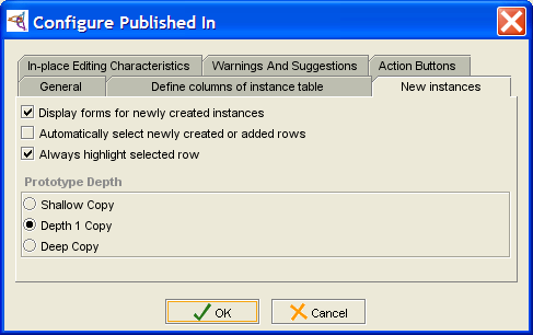
Double-click on the widget to open the Configure Widget dialog box.
Click the New instances tab.
Select the basic options you want:
Display forms for newly-created instances: When enabled, the Instance Editor is automatically displayed whenever the end-user creates a new instance. This allows the user to define the properties of the instance immediately. If this option is disabled, you may want to enable Use in place editing at the In-place Editing Characteristics tab.
Note: Users can still edit the instance by clicking the View Instance (
 ) button.
Automatically select newly created or added rows: When this option is enabled, the row corresponding to the new instance is automatically selected; again, this is useful if you allow in-place editing.
Always highlight selected row: This option is self-explanatory.
Select the Prototype Depth to control how the values in this field are copied if the instance that contains this field is copied:
Shallow Copy: If the containing instance is copied, the copy has the same instance(s) as values for this field that the original does.
Depth 1 Copy: If the containing instance is copied, the value(s) of this field will be shallow copies of the original instances in this field. For example, if this field contains three instances and the containing instance is copied, the new instance will have three new instances at this field; they will be identical to the previous instances except for the name.
Deep Copy: New instances are created for each instance in the field and for any additional referenced instances. See What is a Deep Copy? for more information.
In-Place Editing Characteristics
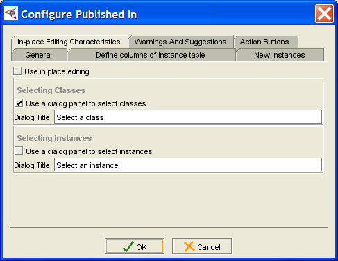
Double-click on the widget to open the Configure Widget dialog box.
Click the In-place Editing Characteristics tab.
Select the options you want:
Use in place editing: This allows the user to edit a value directly in the instance table.
Use a dialog panel to select classes: If the instance values of the field have fields of type Class, enabling this means that double-clicking in the field displays a menu which allows the user to select a class.
Use a dialog panel to select instances: If the instance values of the field have fields of type Instance, enabling this means that double-clicking in the field displays a menu which allows the user to select a class. You may want to enable this if Display forms for newly-created instances is disabled at the New Instances tab.
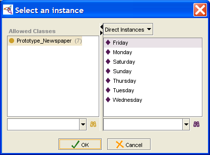
Example: using the dialog panel to select instances
If Use a dialog panel to select instances is enabled, then the user can select an instance as follows:
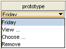
Double-click in the instance field. A menu is displayed:
Select Choose... to open the Select Instance dialog box.
Select the class and instance you want and click OK.
If the field already contains a value, the user can change it in the same manner:
Double-click in the instance field. A menu is displayed:
Select Choose... to open the Select Instance dialog box. You can also choose View... to display the Instance Editor for this instance, or Remove to clear the field.
Select the class and instance you want and click OK.
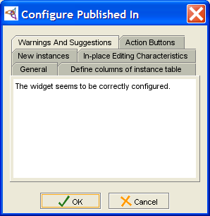
Warnings and Suggestions
You can check the configuration of the widget at the Warnings and Suggestions tab.
Customizing a ContainsWidget
ContainsWidget is an optional widget for slots of type Instance. It contains a version of the Instance Editor for each value of the slot. ContainsWidget is useful primarily for Instance slots where the Editor for the Allowed Classes is fairly simple, and where the cardinality is single or small.
For a widget that provides a summary of selected fields, see InstanceRowWidget or InstanceTableWidget.
You can perform the standard customizations:
Change the widget type of an Instance field to ContainsWidget, using the Widget Type menu.
Resize or move the widget, using click and drag.
Change General properties and/or select Action Buttons, using the corresponding tab in the Configure Widget dialog box; see Changing Widget Configuration Properties for more information.
The Configure Widget dialog box for a ContainsWidget has the following additional customizations: Appearance, Instance Creation, and Summary Panel.
Appearance
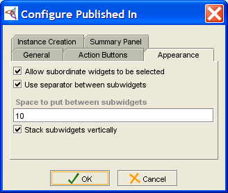
The Appearance tab allows you to control how the "subwidgets", or Instance Editors, are displayed:
Double-click on the widget to open the Configure Widget dialog box.
Click the Appearance tab.
Select the options you want:
Allow subordinate widgets to be selected: allows the user to select and edit the Instance Editor(s) directly inside the widget.
Use separator between subwidgets: places a horizontal line between subwidgets.
Space to put between subwidgets: specifies the spacing, in points.
Stack subwidgets vertically: chooses between a vertical or horizontal display for the subwidgets.
Instance Creation
If you are allowing end-users to create new instances from this field,
you can control various aspects.
If you do not want users to create instances, disable the Create Instance
(![]() ) button,
using the Action Buttons tab.
) button,
using the Action Buttons tab.
Double-click on the widget to open the Configure Widget dialog box.
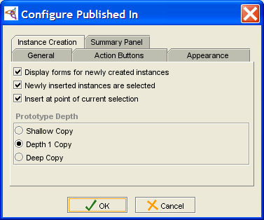
Click the Instance Creation tab.
Select the basic options you want:
Display forms for newly-created instances: When enabled, the Instance Editor is automatically displayed whenever the end-user creates a new instance. This allows the user to define the properties of the instance.
Newly inserted instances are selected: When this option is enabled, the form corresponding to the new instance is automatically selected.
Insert at point of current selection: This option is self-explanatory.
Select the Prototype Depth to control how the values in this field are copied if the instance that contains this field is copied:
Shallow Copy: if the containing instance is copied, the copy has the same instance(s) as values for this field that the original does.
Depth 1 Copy: If the containing instance is copied, the value(s) of this field will be shallow copies of the original instances in this field. For example, if this field contains three instances and the containing instance is copied, the new instance will have three new instances at this field; they will be identical to the previous instances, except for the name.
Deep Copy: New instances are created for each instance in the field and for any additional referenced instances. See What is a Deep Copy? for more information.
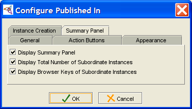
Summary Panel
The Summary Panel is shown at the top of the widget.
Double-click on the widget to open the Configure Widget dialog box.
Click the Summary Panel tab.
Select the options you want:
Display Summary Panel: displays or hides the summary panel
Display Total Number of Subordinate Instances: gives the number of instances in the field.
Display Browser Keys of Subordinate Instances: in the current version, this has no effect.
Using a ResourceListWidget
ResourceListWidget is an optional widget for slots of type String with multiple Cardinality. It is similar in appearance and operation to the default StringListWidget, but allows the end-user to enter a list of URIs. Basic syntax checking is performed on each entered URI, but does not verify that the URI can be accessed.
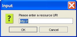
To enter a value in a ResourceList field at the Instances tab:
A dialog box will appear, prompting you to enter a URI as a value.
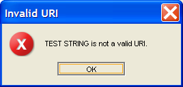
If the string is not a URI, an error message will be displayed:
If the string appears to be a URI, the string will be added to the resource list.
You can also view/edit a resource
by highlighting it and selecting the View Value
(![]() ) button,
or delete a resource by highlighting it and clicking the Delete Value
(
) button,
or delete a resource by highlighting it and clicking the Delete Value
(![]() ) button.
) button.
Additional Widget Types
When Protege-Frames generates a default layout, it creates a default widget for each slot. However, the Widget Type menu allows you to to change the widget type for the currently selected widget. The choices for type of widget depend on the value type of the slot. Some value types have only one possible widget.
The following additional widget types are available:
InstanceRowWidget or InstanceTableWidget, which allow you to see a summary of all the slots of an Instance value
ContainsWidget, which displays the Instance or Class Editor for single or multiple Instance or Class values
DirectInstancesWidget, which restricts the values of an Instances field to direct instances of the Allowed Classes.
You can also change a Boolean field from a CheckBoxWidget to a ComboBoxWidget.
In addition, the graph widget is available for some fields.
Note: You may see additional widgets on the Selected Widget Type menu. Not all of these widgets are currently working correctly; we do not recommend the use of widgets other than the ones listed here unless they are part of a plug-in.
To change a widget, first select the widget you want to change, then select the new widget type from the Widget Type menu.
