Difference between revisions of "PrF UG forms change widget config"
(Automated import of articles) |
|||
| Line 4: | Line 4: | ||
{{PrF_UG_TOC_forms}}<div id='prf_ug'> | {{PrF_UG_TOC_forms}}<div id='prf_ug'> | ||
| − | The Widget Configuration dialog box allows you to customize the label, | + | The Widget Configuration dialog box allows you to customize |
| − | buttons, | + | the label, buttons, and other properties of a selected widget. |
| − | and other properties of a selected widget. | + | This dialog has a number of tabs, depending on the widget type. |
| − | This dialog has a number of tabs, | ||
| − | depending on the widget type. | ||
| − | |||
| − | + | For some widgets, you can customize additional properties. | |
| − | |||
| − | |||
| − | |||
| − | |||
| − | |||
| − | |||
| − | |||
| − | |||
| − | |||
| − | |||
| − | |||
| − | |||
| − | |||
| − | |||
| − | |||
| − | |||
| − | For some widgets, | ||
| − | you can customize additional properties. | ||
See the specific topic for the widget for more information. | See the specific topic for the widget for more information. | ||
| Line 39: | Line 18: | ||
<li><p> | <li><p> | ||
<i>the widget label</i>: | <i>the widget label</i>: | ||
| − | Each widget has a label - a string of text displayed in the left-hand corner of the widget. | + | Each widget has a label - |
| + | a string of text displayed in the left-hand corner of the widget. | ||
The default layout uses a version of the slot name for the widget label, | The default layout uses a version of the slot name for the widget label, | ||
| − | where underscores are replaced by blanks and the first letters of the resulting words are capitalized. | + | where underscores are replaced by blanks |
| + | and the first letters of the resulting words are capitalized. | ||
When end users actually enter instances, | When end users actually enter instances, | ||
they use the label to determine the type of information they should enter. | they use the label to determine the type of information they should enter. | ||
Revision as of 15:39, October 14, 2008
Changing Widget Configuration Properties
The Widget Configuration dialog box allows you to customize the label, buttons, and other properties of a selected widget. This dialog has a number of tabs, depending on the widget type.
For some widgets, you can customize additional properties. See the specific topic for the widget for more information.
Changing General Properties
You can change the following properties at the General tab of the Configuration Dialog:
the widget label: Each widget has a label - a string of text displayed in the left-hand corner of the widget. The default layout uses a version of the slot name for the widget label, where underscores are replaced by blanks and the first letters of the resulting words are capitalized. When end users actually enter instances, they use the label to determine the type of information they should enter.
the widget tool tip: This is displayed as a pop-up when the user holds the cursor over the widget label.
To change the General properties of a widget:
Double-click directly on the widget. The Widget Configuration dialog box will be displayed. (Note: If the Form Configuration dialog box is displayed, you have accidentally double-clicked somewhere on the background of the form. Close the dialog box and double-click on the widget.)
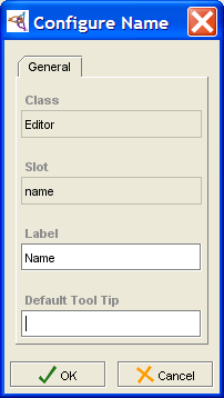
Enter the label you want in the Label field of the Widget Configuration dialog box. You can use a multi-word phrase.
To create a tool tip, type the text you want in the Default Tool Tip field.
To implement your changes, click OK.

Choosing a Widget's Buttons
Some widgets (e.g., Class and Instance widgets, Multiple Cardinality widgets) have buttons displayed on their upper right corners. You can turn the display of these buttons on and off individually. To choose which buttons are displayed for a widget:
Double-click directly on the widget. The Widget Configuration dialog box will be displayed. (Note: If the Form Configuration dialog box is displayed, you have accidentally double-clicked somewhere on the background of the form. Close the dialog box and double-click on the widget.)
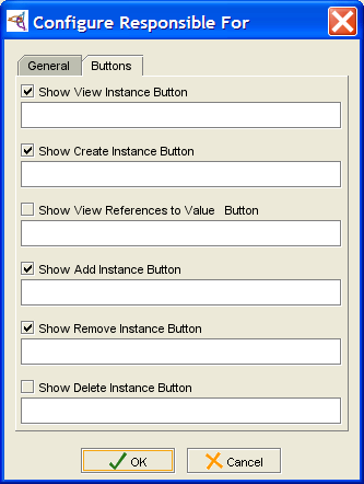
If the widget has buttons, there will be a Buttons tab in the Widget Configuration dialog box. Click this tab.
Select the buttons you want to display by making sure there is a check in the appropriate boxes.
Click OK.
