Difference between revisions of "PropertyFormPortlet"
(→Examples) |
|||
| Line 122: | Line 122: | ||
More documentation about the properties of the widgets will be added as requested by the users. | More documentation about the properties of the widgets will be added as requested by the users. | ||
| + | |||
| + | = Using grids (tables) = | ||
| + | |||
| + | Here is a [http://smi-protege.stanford.edu/svn/icat/trunk/war/projectConfigurations/configuration_Collaborative%20Newspaper.xml?view=markup simple example] on how to configure the a grid widget. A grid widget is used for displaying instances (on rows) and their properties (on columns). | ||
| + | |||
| + | The grid is similar in functionality to the Protege 3.x [http://protegewiki.stanford.edu/wiki/PrF_UG_forms_custom_instancerow <code>InstanceTable</code>] slot widget. It should be used on properties that have as values one or multiple instances. Each row represents an instance value, and the configured columns show the properties of the instance value. | ||
| + | |||
| + | Below is an example from the Newspaper ontology: | ||
| + | |||
| + | <pre> | ||
| + | |||
| + | <portlet> | ||
| + | <name>edu.stanford.bmir.protege.web.client.ui.portlet.propertyForm.PropertyFieldPortlet</name> | ||
| + | <height>200</height> | ||
| + | <width>0</width> | ||
| + | |||
| + | <properties> | ||
| + | <entry> | ||
| + | <string>tabs</string> | ||
| + | <list> | ||
| + | <map> | ||
| + | <entry> | ||
| + | <string>title</string> | ||
| + | <string>Contents</string> | ||
| + | </entry> | ||
| + | |||
| + | <entry> | ||
| + | <string>contents</string> | ||
| + | <map> | ||
| + | <entry> | ||
| + | <string>name</string> | ||
| + | <string>contents</string> | ||
| + | </entry> | ||
| + | <entry> | ||
| + | <string>label</string> | ||
| + | <string>Contents</string> | ||
| + | </entry> | ||
| + | <entry> | ||
| + | <string>tooltip</string> | ||
| + | <string>The contents of the newspaper is modeled as a list of instances of class Content.</string> | ||
| + | </entry> | ||
| + | <entry> | ||
| + | <string>help</string> | ||
| + | <string>http://protege.stanford.edu/doc/users_guide/newspaper_example.html</string> | ||
| + | </entry> | ||
| + | <entry> | ||
| + | <string>index</string> | ||
| + | <string>1</string> | ||
| + | </entry> | ||
| + | <entry> | ||
| + | <string>height</string> | ||
| + | <string>200</string> | ||
| + | </entry> | ||
| + | <entry> | ||
| + | <string>component_type</string> | ||
| + | <string>grid</string> | ||
| + | </entry> | ||
| + | <entry> | ||
| + | <string>show_add_existing</string> | ||
| + | <boolean>true</boolean> | ||
| + | </entry> | ||
| + | <entry> | ||
| + | <string>ont_type</string> | ||
| + | <string>Content</string> | ||
| + | </entry> | ||
| + | <entry> | ||
| + | <string>multiple_values_allowed</string> | ||
| + | <boolean>true</boolean> | ||
| + | </entry> | ||
| + | <entry> | ||
| + | <string>Column1</string> | ||
| + | <map> | ||
| + | <entry> | ||
| + | <string>header</string> | ||
| + | <string>Headline</string> | ||
| + | </entry> | ||
| + | <entry> | ||
| + | <string>width</string> | ||
| + | <string>all</string> | ||
| + | </entry> | ||
| + | <entry> | ||
| + | <string>property</string> | ||
| + | <string>headline</string> | ||
| + | </entry> | ||
| + | <entry> | ||
| + | <string>index</string> | ||
| + | <string>0</string> | ||
| + | </entry> | ||
| + | </map> | ||
| + | </entry> | ||
| + | <entry> | ||
| + | <string>Column2</string> | ||
| + | <map> | ||
| + | <entry> | ||
| + | <string>header</string> | ||
| + | <string>Expiration date</string> | ||
| + | </entry> | ||
| + | <entry> | ||
| + | <string>width</string> | ||
| + | <string>100</string> | ||
| + | </entry> | ||
| + | <entry> | ||
| + | <string>property</string> | ||
| + | <string>expiration_date</string> | ||
| + | </entry> | ||
| + | <entry> | ||
| + | <string>index</string> | ||
| + | <string>1</string> | ||
| + | </entry> | ||
| + | <entry> | ||
| + | <string>field_type</string> | ||
| + | <string>combobox</string> | ||
| + | </entry> | ||
| + | <entry> | ||
| + | <string>allowed_values</string> | ||
| + | <list> | ||
| + | <string>today</string> | ||
| + | <string>tomorrow</string> | ||
| + | </list> | ||
| + | </entry> | ||
| + | </map> | ||
| + | </entry> | ||
| + | </map> | ||
| + | </entry> | ||
| + | |||
| + | </map> | ||
| + | </list> | ||
| + | </entry> | ||
| + | </properties> | ||
| + | </portlet> | ||
| + | |||
| + | </pre> | ||
Revision as of 14:58, June 10, 2013
Form Based Editing in WebProtege
Contents
Learn more about how the layout configuration works in WebProtege by following this tutorial.
Examples of form editing widgets
The PropertyFieldPortlet (edu.stanford.bmir.protege.web.client.ui.portlet.propertyForm.PropertyFieldPortlet) supports the form-based editing in WebProtege. The portlet allows the association of a property with an editing widget. There are different types of editing widgets: text field, text area, check box, radio box, combo box, html, instance table, etc. This feature is similar to the form-based editing support in Protege 3.x. The editing widgets can be organized in tabs.
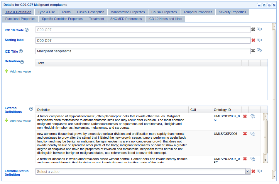
An example of the PropertyFieldPortlet is shown below:
The example shows the tab structure of the portlet. There are examples of a instance textfield widget (ICD title), text fields (code, sorting label), instance table (definition and external definition) and drop-down list (editorial status).
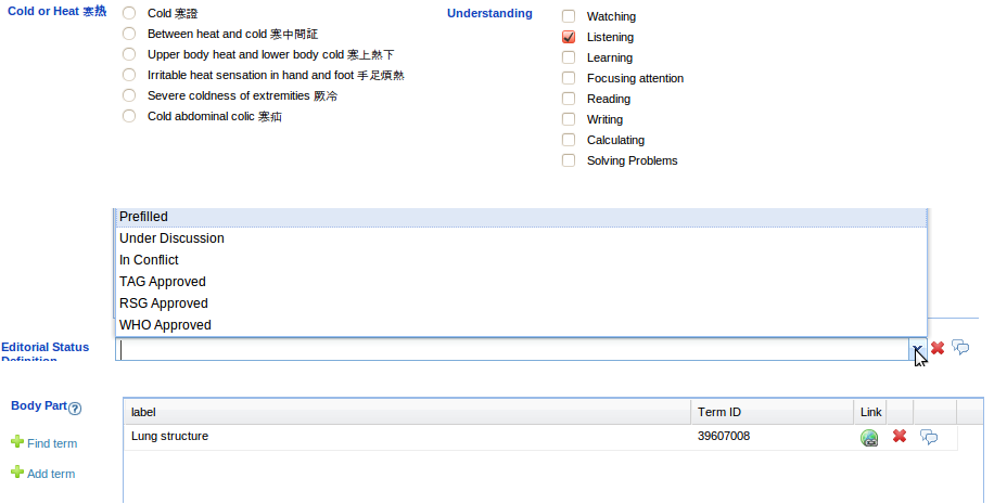
Other examples of editing widgets (check box, radio box, combo box, BioPortal reference widget) are shown in the figure below:
Types of property editing widgets
One or more property editing widgets can be added to a PropertyFormPortlet. The types of widgets are enumerated below:
- textfield - editing of string values in a text field
- textarea - editing of string values in a text area
- combobox - editing of simple or instance values using a drop-down list
- htmleditor - editing of string values using an HTML editor
- multitextfield - editing of string multi-values (for properties with multiple cardinality)
- htmlMessage - embed some HTML text or an external HTML into the portlet
- classselect - widget to set a class as the value of a property. Class is selected from a class tree
- propertyselect - widget to select a property using a property tree
- externalreference - widget to create a reference to an external ontology or terminology stored in BioPortal
Instance widgets (useful for reified instances):
- instancetextfield - if the the property value is an instance, shows in a text field one of the properties of the value instance
- instancecheckbox - show as checkboxes an instance value set (multiple cardinality)
- instanceradiobutton - show as radio box an instance value set (single cardinality)
- grid - shows an instance table widget similar to the rich client (single or multiple cardinality)
Note. The list of available widgets will be extended as needed. The name of the widgets might also change in future releases.
Configuration of the property editing widgets
Unfortunately the only way to configure the widgets in a PropertyFieldPortlet is to edit the layout configuration XML file. We are working on creating a user interface that would simplify the configuration process. Until then, please bear with us.
Each widget has properties associated to it in form of key:value pairs that control the configuration of the widget.
Below is an example of configuring the PropertyFieldPortlet to display for the rdfs:label a multitextfield widget and for the rdfs:comment uses a textarea widget.
<portlet>
	<name>edu.stanford.bmir.protege.web.client.ui.portlet.propertyForm.PropertyFieldPortlet</name>
        <height>200</height>
	<width>0</width>
	<properties>
		<entry>
			<string>tabs</string>
			<list>
				<map>
					<entry>
						<string>title</string>
						<string>Metadata</string>
					</entry>
					<entry>
						<string>http://www.w3.org/2000/01/rdf-schema#label</string>
						<map>
							<entry>
								<string>name</string>
								<string>http://www.w3.org/2000/01/rdf-schema#label</string>
							</entry>
							<entry>
								<string>label</string>
								<string>Label</string>
							</entry>
							<entry>
								<string>component_type</string>
								<string>multitextfield</string>
							</entry>
							<entry>
								<string>index</string>
								<string>0</string>
							</entry>
						</map>
					</entry>
					<entry>
						<string>http://www.w3.org/2000/01/rdf-schema#comment</string>
						<map>
							<entry>
								<string>name</string>
								<string>http://www.w3.org/2000/01/rdf-schema#comment</string>
							</entry>
							<entry>
								<string>label</string>
								<string>Comment</string>
							</entry>
							<entry>
								<string>component_type</string>
								<string>textarea</string>
							</entry>
							<entry>
								<string>index</string>
								<string>1</string>
							</entry>
						</map>
					</entry>
				</map>
			</list>
		</entry>
	</properties>
 </portlet>
The component_type is one of the types specified in the section above. The first entry in the property of the tabs (E.g. <string>http://www.w3.org/2000/01/rdf-schema#label</string>
) is the property name to which the widget is associated. The name property must point to a unique name for the widget. The label property sets the display label in front of the widget. index specifies on what position in the tab should the widget be placed (0 - top, 1- below 0, etc.).
Different widgets have additional supported properties. Some of them support the read_only property, which can be used to make a widget read-only (in the first figure, ICD 10 code). The grid widget (a.k.a Instance Table Widget) has properties for setting the columns in the table, their width, their type, etc.
More documentation about the properties of the widgets will be added as requested by the users.
Using grids (tables)
Here is a simple example on how to configure the a grid widget. A grid widget is used for displaying instances (on rows) and their properties (on columns).
The grid is similar in functionality to the Protege 3.x InstanceTable slot widget. It should be used on properties that have as values one or multiple instances. Each row represents an instance value, and the configured columns show the properties of the instance value.
Below is an example from the Newspaper ontology:
<portlet>
	<name>edu.stanford.bmir.protege.web.client.ui.portlet.propertyForm.PropertyFieldPortlet</name>
    <height>200</height>
	<width>0</width>

	<properties>
		<entry>
			<string>tabs</string>
			<list>
				<map>
					<entry>
						<string>title</string>
						<string>Contents</string>
					</entry>

					<entry>
						<string>contents</string>
						<map>
							<entry>
								<string>name</string>
								<string>contents</string>
							</entry>
							<entry>
								<string>label</string>
								<string>Contents</string>
							</entry>
							<entry>
								<string>tooltip</string>
								<string>The contents of the newspaper is modeled as a list of instances of class Content.</string>
							</entry>
							<entry>
								<string>help</string>
								<string>http://protege.stanford.edu/doc/users_guide/newspaper_example.html</string>
							</entry>
							<entry>
								<string>index</string>
								<string>1</string>
							</entry>
							<entry>
								<string>height</string>
								<string>200</string>
							</entry>
							<entry>
								<string>component_type</string>
								<string>grid</string>
							</entry>
							<entry>
								<string>show_add_existing</string>
								<boolean>true</boolean>
							</entry>
							<entry>
								<string>ont_type</string>
								<string>Content</string>
							</entry>
							<entry>
								<string>multiple_values_allowed</string>
								<boolean>true</boolean>
							</entry>
							<entry>
								<string>Column1</string>
								<map>
									<entry>
										<string>header</string>
										<string>Headline</string>
									</entry>
									<entry>
										<string>width</string>
										<string>all</string>
									</entry>
									<entry>
										<string>property</string>
										<string>headline</string>
									</entry>
									<entry>
										<string>index</string>
										<string>0</string>
									</entry>
								</map>
							</entry>
							<entry>
								<string>Column2</string>
								<map>
									<entry>
										<string>header</string>
										<string>Expiration date</string>
									</entry>
									<entry>
										<string>width</string>
										<string>100</string>
									</entry>
									<entry>
										<string>property</string>
										<string>expiration_date</string>
									</entry>
									<entry>
										<string>index</string>
										<string>1</string>
									</entry>
									<entry>
										<string>field_type</string>
										<string>combobox</string>
									</entry>
									<entry>
										<string>allowed_values</string>
										<list>
											<string>today</string>
											<string>tomorrow</string>
										</list>
									</entry>
								</map>
							</entry>
						</map>
					</entry>

				</map>
			</list>
		</entry>
	</properties>
 </portlet>
Examples
The easiest way to create the XML configuration for a PropertyFieldPortlet is to start with an existing example and change it.
We have some example using this portlet here:
- Simple example showing the use of the PropertyFormPortlet with the Newspaper example.
- Complex example showing all features for the configuration of the ICD ontology.
- Example snippets for different forms.

